Branding
Indigenising Design
Role
Graphic Designer
Collaborators
John Moore, Lucy Shand, Kimiora Whaanga, Te Hana Goodyer
Client
British Council
Industry
Creative Arts
Year
2024
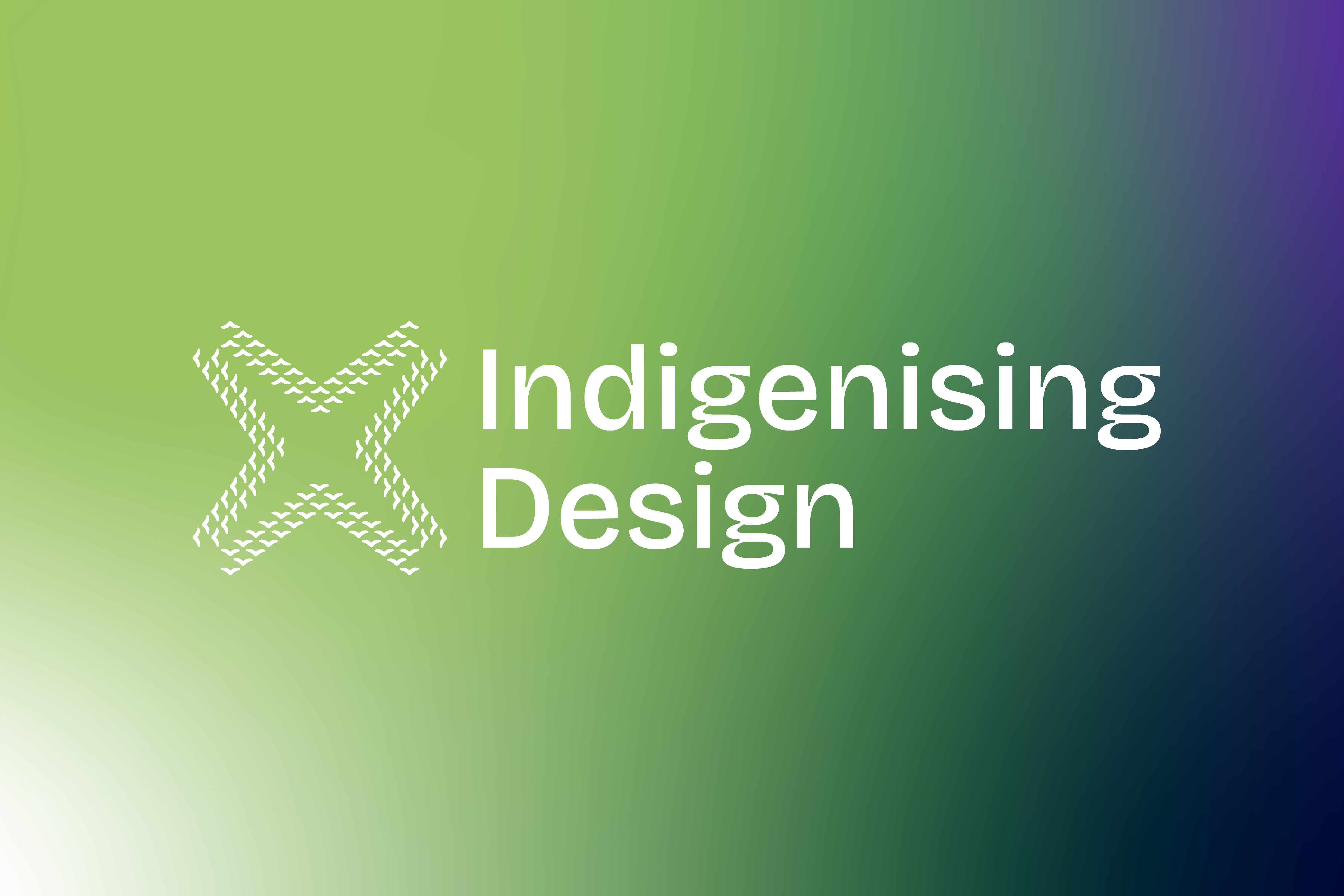
Designed a brand identity inspired by our orignal orators and messengers - birds.
Problem :
Indigenising Design is on a mission to unite global voices to rethink design through an Indigenous lens, celebrating Indigenous cultures while challenging the impacts of colonisation in our built spaces. Promoting equity and diversity in design practices. IDIA was tasked with designing a visual identity that embodies the essence of their mission—to bring people together from all corners of the earth.
Solution :
We explored birds as the central theme of our concepts, recognising them as the primary messengers in our communities, connecting us from above to below. I drew inspiration from the whakataukī (proverb) “E koekoe te tūī, e ketekete te kākā, e kūkū te kererū” (The tūī chatters, the kākā cackles, and the kererū coos), understanding that this visual identity must create space for diverse voices within this kaupapa.
This proverb reminds us to acknowledge communities from all four corners of the earth, encouraging them to come together to talk, connect, and engage with one another in space that's inviting and safe.
The colour palette draws from the kererū, a revered native bird of Aotearoa. Its iridescent plumage—ranging from purples to emerald greens and midnight blues—reflects light, symbolising the vibrancy, diversity, and distinctiveness of the kaupapa.


Challenge :
One of the key challenges was creating a visual identity that could honour diverse Indigenous communities globally while remaining culturally specific, respectful, and legible. Each bird motif carries deep symbolic meaning, so we had to carefully consider form, posture, and interaction to convey connectivity and conversation without oversimplifying cultural narratives.
Balancing this iconographic complexity with functional clarity was crucial—ensuring the identity works across digital and print applications while reflecting the nuance of the original inspiration from whakataukī. Colour, composition, and hierarchy were deliberately chosen to amplify meaning, accessibility, and inclusivity, allowing the design to celebrate diversity while remaining cohesive and impactful.
Below are the other two concepts we presented to the client, each showcasing birds connecting, sharing, and engaging in conversation across all four corners of the earth.


Summary :
The visual identity will continue to support their webinar series, which brings together designers, academics, and change makers to engage in meaningful discussions on a range of important topics. This platform fosters connection, collaboration, and the exchange of ideas, creating a space where diverse perspectives can be shared and celebrated.
If you’d like to tune into their webinar series, please visit their website for more information and upcoming sessions.

